Short Articles on Data Science
#211 – Antibiotics effective on drug-resistant bacteria have been found using computer-aided drug discovery running machine learning/AI search algorithms on databases of pharmaceutical compounds
Feb 21st, 2020
Researchers at MIT trained a deep learning algorithm using 2,500 compounds that were effective at killing bacteria. They then turned the algorithm loose on 6000 compounds under investigation and found “halicin”. They then expanded the search space of the algorithm to 107 million (~7%) of a massive database of 1.5 billion known pharma compounds. In a few hours, the algorithm had identified 23 promising candidates, of which two, in addition to halicin, have been found to be highly effective in lab trials on almost all known drug-resistant bacteria.
This is good news for medical science, and great news for the potency of deep machine learning.
[1] Discovering novel super antibiotics using machine learning
#191 – Statistical Testing: Why Signal to Noise (and Type II errors) matter.
Mon 19th August, 2019
The sample size for a statistical test is a function of three factors:
(1) significance level, or what likelihood to assign Type 1 errors (false alarms). Typically this is at least 5% (95% confidence).
(2) power of the test to detect the effect, or what likelihood to assign Type 2 errors (missed detections). Typically this is at least 20% (80% power), though for important studies, this will be 10% (90% power).
(3) Signal to Noise Ratio (SNR), which is the ratio of the difference in the means (signal) and the standard deviation in measurements (noise).
The result indicates the recommended sample size.
Rules of thumb:
SNR=0.2 means N=500,
SNR=1.0 means N=20,
SNR>=2.0 means N<=6.

Sample Size from Signal to Noise Ratio and Desired Power
Reference:
Power & Sample Size
#186 – Data looks better naked. Less is more… effective, attractive, impactive.
Sat 20th July, 2019
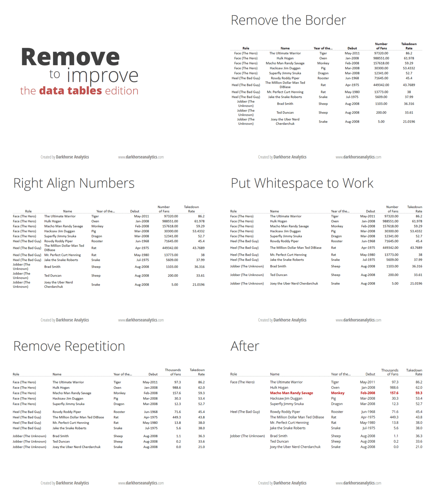
In Aug 2013, Joey Cherdarchuk, cofounder of Darkhorse Analytics, published the 3-part series called Data looks better naked.
Everyone working with tables, numbers, data, visualizations, will benefit from looking at the slides. The changes are easy to make but powerful. They embody some fundamental tenets: (1) maximize the data-ink ratio by reducing non-data related ink, (2) simplify, (3) to let the data speak for itself i.e. get rid of the clutter.
Love the quote at the end: “Perfection is achieved not when there is nothing more to add, but when there is nothing left to take away” – Antoine de Saint-Exupery
The series:
Part I: Improve your Bar Charts
Part II: Improve your Data Tables
Part III: Improve your Heat Maps
References:
#113 20170806 – Tribute to Usain Bolt – 100m stats
#101 20160917 – Data & Infographics – The Fallen in the World War
#100 20160917 – Data Visualization – The Fallen in the World War
#092 20160313 – Financial Signals in the US Macro Economy
#081 20151007 – Analytics in the AWS cloud
#080 20150923 – Distinguishing occupants in a room
#55b 20140927 – Big Data isn’t about Big The focus on data should be about analytical capability rather than size: “‘Big Data’ is the subjective state a company finds itself in when its human and technical infrastructure can’t keep pace with its data needs.”
#049 20140819 – Presenting Data: Less terrible tables
#036 20140627 – “The Map is Not the Territory”
#033 20140624 – Who, really, is a Data Scientist?


Leave a Reply